Weave
2025 Rewind

Overview
Weave is the leading software company for dental and veterinary clinics, offering tools for communication, payment processing, scheduling, document management, and marketing.
Weave Rewind is a personalized, Spotify Wrapped-style experience that surfaces meaningful metrics for each user: messages sent, average call length, fastest response time, and more. I led the end-to-end design of the 2025 Rewind, from technology selection through final animation, within a three-week window. The core challenge: delivering a fully dynamic, per-user animation without creating duplicate work for engineering or sacrificing quality under the timeline.
Process
The Problem
The ask was straightforward; create a "2025 Weave Rewind" experience. The constraints were not. Three weeks for total completion meant I had to make smart decisions early, because any misstep in approach would be expensive to reverse.
The goal of Rewind is two-fold: get customers genuinely excited about Weave, and reinforce the value Weave delivers throughout the year. A static slide deck of numbers wouldn't accomplish either. The experience needed motion and it needed to feel personal.
Feasibility: Choosing the Right Technology
Before touching a single frame, I pulled in the engineers involved and got aligned on execution. I mapped out four possible approaches and evaluated each against our constraints.
Fully coded JavaScript animations. High quality ceiling, but time-intensive and created overlap: design would produce reference animations, engineering would re-create them in code. Too much duplicated effort for a three-week window.
Video backdrop with JavaScript-injected values. Reduced some duplication, but introduced a new problem. Syncing coded value animations with a pre-rendered video backdrop added complexity without a clear payoff.
Rive. Powerful and purpose-built for this kind of work, but a net-new tool for Weave's engineering team. Ramp-up time was a real risk, and it was unclear whether exporting a shareable .mp4 was viable.
Lottie. Logic can't be baked directly into a Lottie file, but that turned out to be the right constraint. It kept the animation layer clean while leaving the dynamic behavior in engineering's hands, where it belonged.
My recommendation was a series of Lottie files, one per metric. Each .json file would be independently skippable. If a user's data for a given metric was missing or fell outside the valid range, that animation would simply be omitted. This gave engineering a clean integration path and gave us a small but meaningful lever for personalization through code logic alone.
Execution: Animation and Scripting
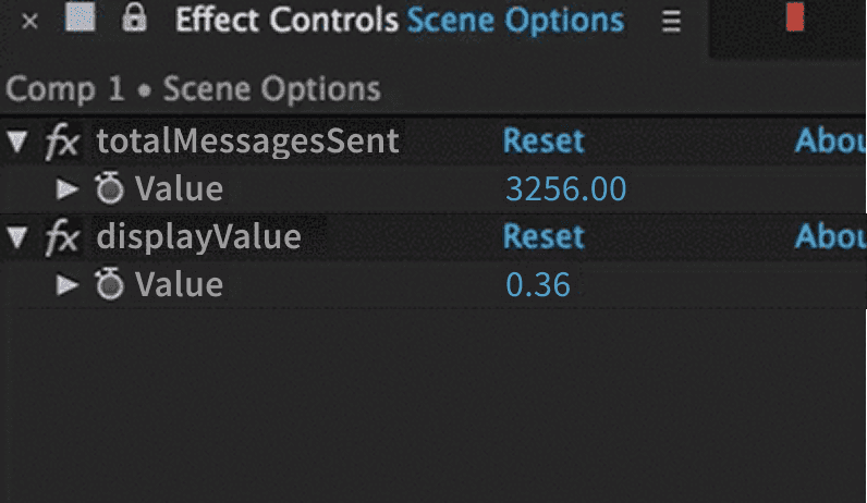
I built the animations in After Effects, taking advantage of its expression scripting to handle the dynamic value behavior entirely within the comp.
For every text layer displaying a user-specific value, I created two Slider effect properties. The first was named to match the data field the engineer would target at runtime (e.g. totalMessagesSent), and served as the source value. The second, displayValue, was keyframed from 0 to 1 and drove the on-screen count-up through an expression that interpolated between zero and the injected value.
A few metrics required additional scripting to handle edge cases, specifically locking the display to whole numbers at the start of the animation before the value begins climbing, which creates a more satisfying and legible count-up feel.
I also wrote formatting expressions to handle number presentation automatically:
Strip decimals where not needed
Add comma separators for thousands and millions
Render time-based values in the correct format (e.g. 0:04.26)
This meant engineering could inject a raw number and the animation would handle the rest, with no formatting logic required on their end.
Outcome
Discoverability
A great animation only matters if users find it. I designed a banner entry point with subtle motion to draw the eye without being disruptive. Placement was intentional: the lower-right corner avoids colliding with system notifications, which surface in the upper-right.
If the user dismisses the banner, a persistent icon in the left navigation keeps Rewind accessible. Both the banner and the nav icon remain visible through January. After that, users can access past Rewinds from their profile.
Final Delivery: A Few Notes on the Experience
Here's a sample of the full video. Some final notes on execution details:
Music intentionally does not sync to specific moments in the animation. Because not all users see all metrics, there is too much variability in runtime to justify the effort of syncing, and it would have been significant effort.
The sample video uses placeholder values.
Most users will see one or two badges based on their personal or office stats. The sample shows all possible badges.
Earned badges can replace a user's default avatar. Other users in the same organization can see all badges a user has earned by hovering on their avatar.
Marketing Assets
I created looping animations of each of the badges and delivered gifs and mp4s for the marketing team for promotion materials.


*Copyrights for these designs belong to
Weave Communications, Inc